Designing a Class Performance Analytics

OVERVIEW
The Student Learning Space (SLS) is an online learning platform developed for schools across Singapore.
The shift to online teaching accelerated during the Covid-19 pandemic lockdown. Many teachers struggled to monitor students’ performance effectively, while students remained unaware of their learning gaps due to the absence of personalized attention.
This feature is designed to address the need for a dedicated space to track class performance, providing teachers and students with meaningful insights and analysis.
TASK
1. Requirement gathering through carrying out research and data synthesis
2. Propose an experience that allows teacher and student to study performance data
3.Create the user interface design for the proposed feature
3.Create the user interface design for the proposed feature
CLIENT
Ministry of Education, Singapore
ROLE
UX / UI Designer
TIME
3 months (3 design sprints)
Year: 2021
RESEARCH
Affinity Mapping
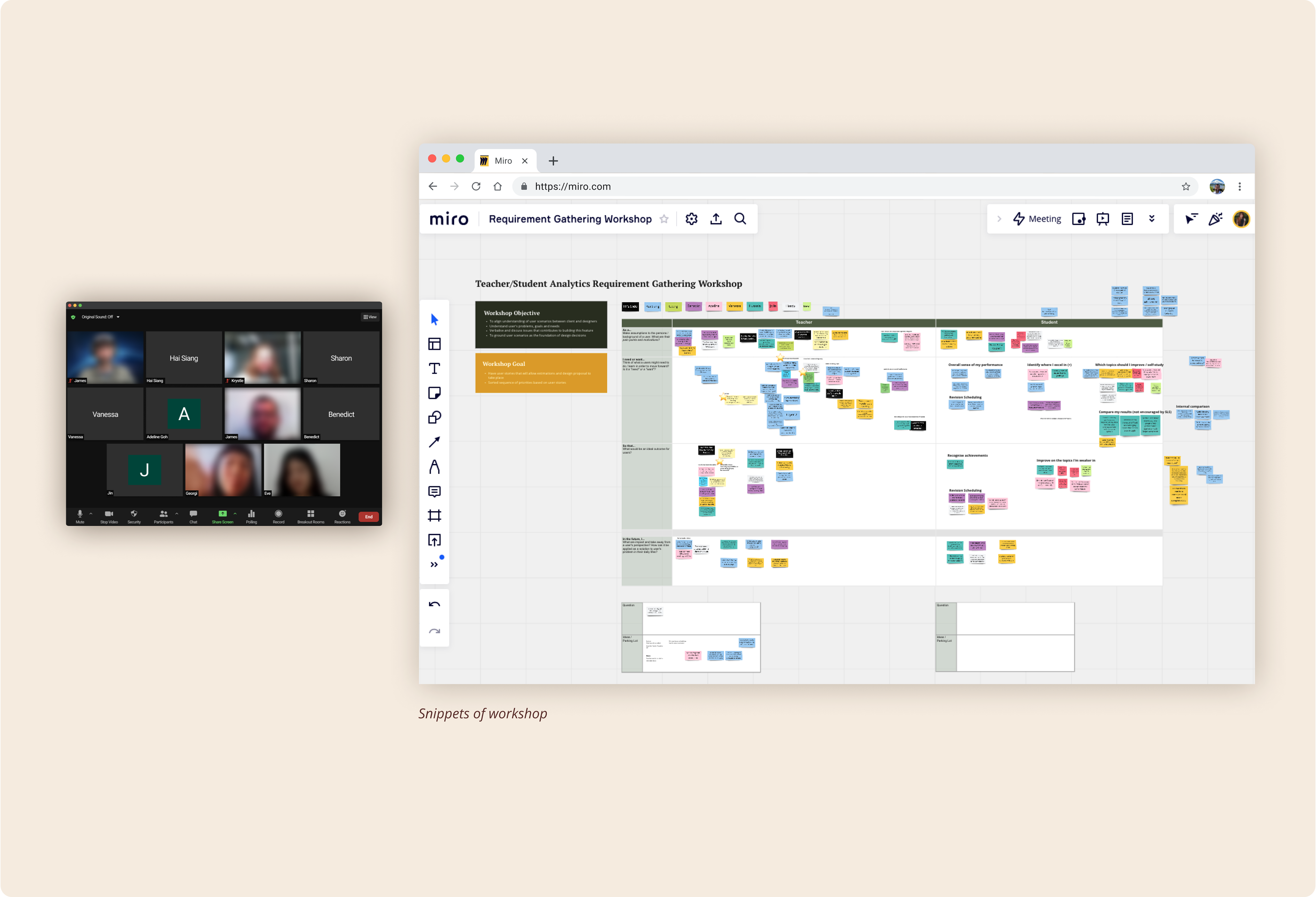
I planned and facilitated a workshop using the Affinity Mapping technique to gather user requirements. With everyone working remotely due to Covid, this was a unique and insightful experience.
I discovered that using Miro and Zoom proved to be surprisingly effective and efficient for collecting valuable insights. The virtual tools not only streamlined collaboration but also allowed participants to contribute asynchronously, accommodating different schedules and time zones.
The workshop also fostered a sense of inclusivity, as remote participation removed geographical barriers and encouraged diverse perspectives.
Synthesising the data
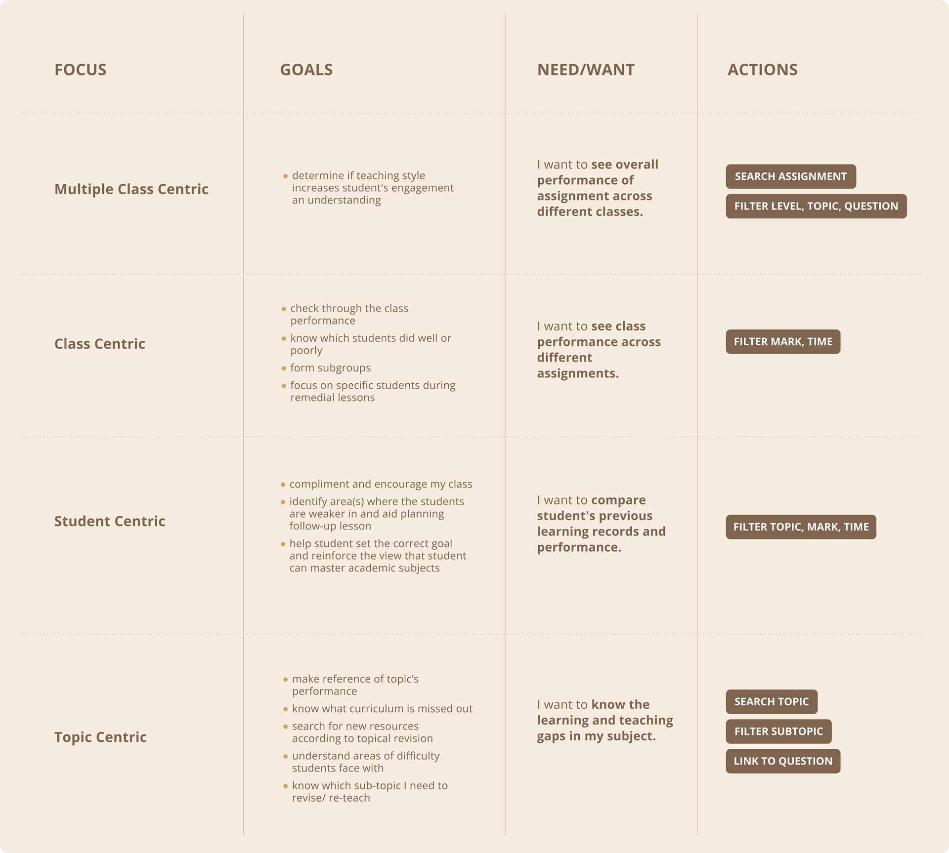
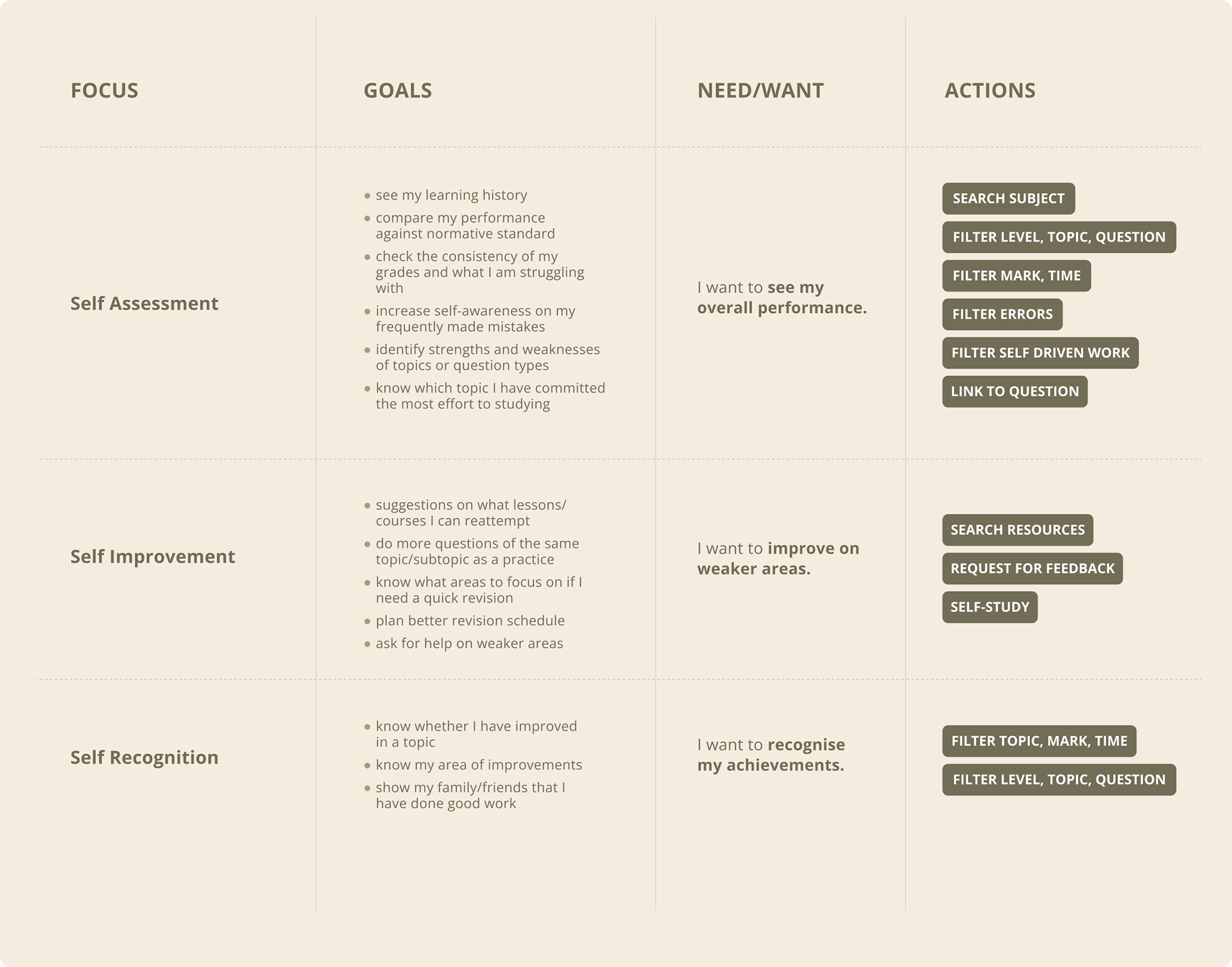
To better analyze the insights gathered, we organized them into several focus areas. This approach allowed us to concentrate our efforts on understanding and differentiating the goals of teachers and students.
Teacher’s area of focus:
Student's area of focus:
IDEATION
Wireframes
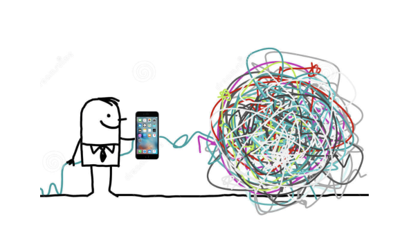
Building a new feature on top of an existing product can feel like trying to charge my phone from a tangled pile of cables. To succeed, I first need to untangle the mess—which, in this context, means understanding the product's legacy and intricacies.
With a solid grasp of the product, the wireframe gains greater depth and coverage. This allowed me to design a more seamless and intuitive flow for the feature.
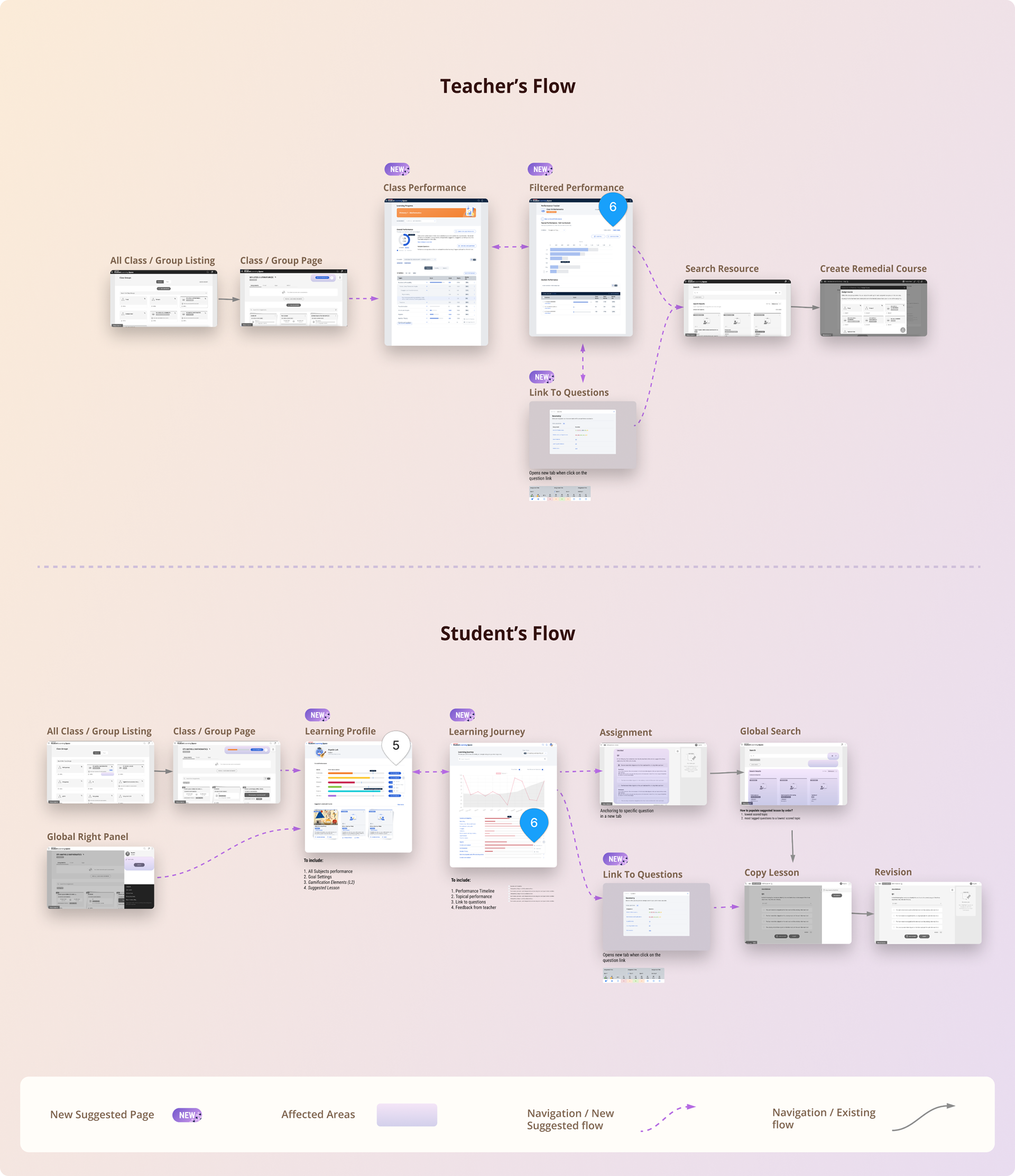
As illustrated in the wireframe, I intentionally highlighted the impacted areas and the new additions. This approach served as a valuable reference, facilitating productive discussions between developers and my clients.
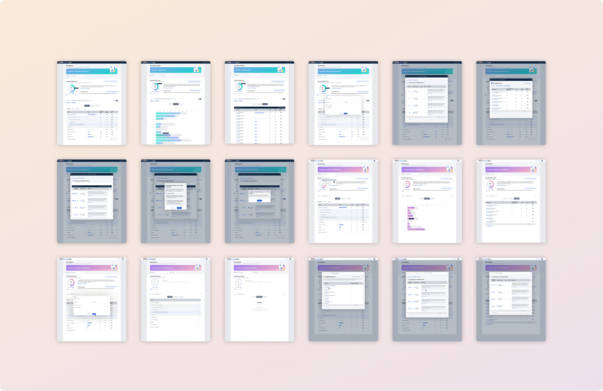
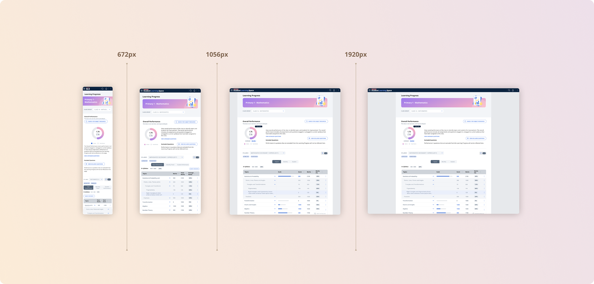
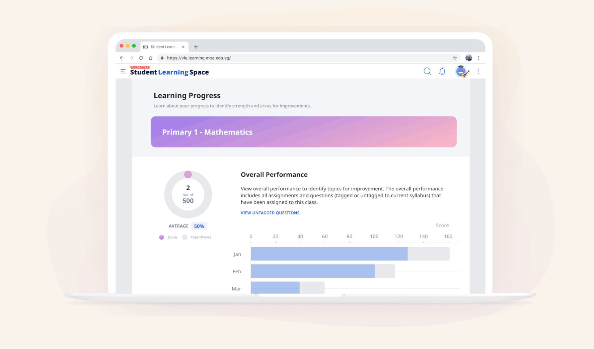
VISUAL DESIGN
High-Fidelity Mock-ups
The final part of my task is to illustrate a beautiful experience where teachers and students can derive meaningful insights from their performance. The UI is blended with the existing style guide and responsive guidelines to ensure consistency throughout the portal.